Brand Identity, Packaging Design, and Campaign
Pulse was designed to empower female runners by advocating for a healthier approach to training. It highlights the importance of proper nutrition, fueling, and recovery to prevent energy deficiencies and support long-term healthy performance. Focusing on three products: electrolytes for Post-run Hydration, Energy Bites for Mid-run Fuel, and a yoga mat for “Post-Run Movement.” Pulse was designed to be a partner in motion before, during, and after your run.
Brand Identity
For my color palette, I chose bright colors that mirror the energy, adrenaline, and high-intensity activities that Pulse products are designed to support. I created custom icons that guide the consumers through each product. They are designed to be simple and serve as an intuitive signal that highlights the purpose of each product using phrases such as “boost your energy,” “power your run," and “accelerate your recovery.” These branding elements were selected with female runners in mind while still appealing to a larger audience.


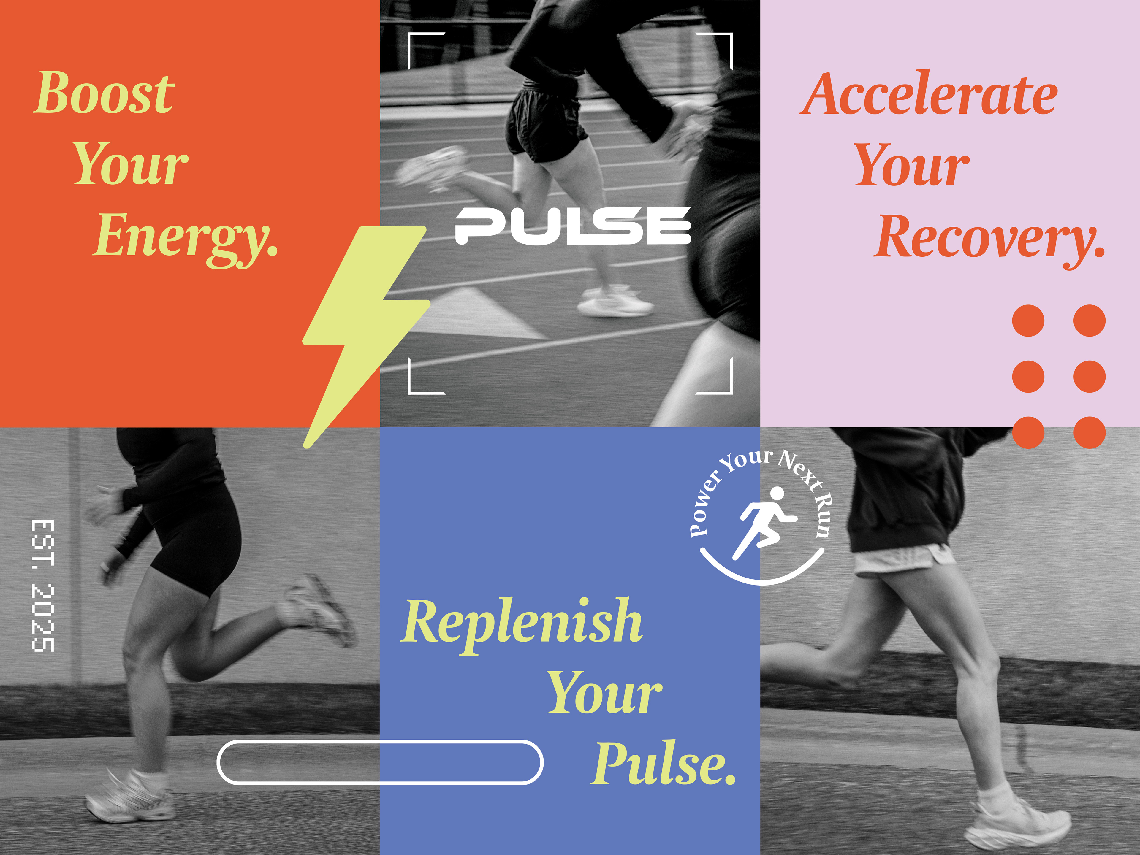
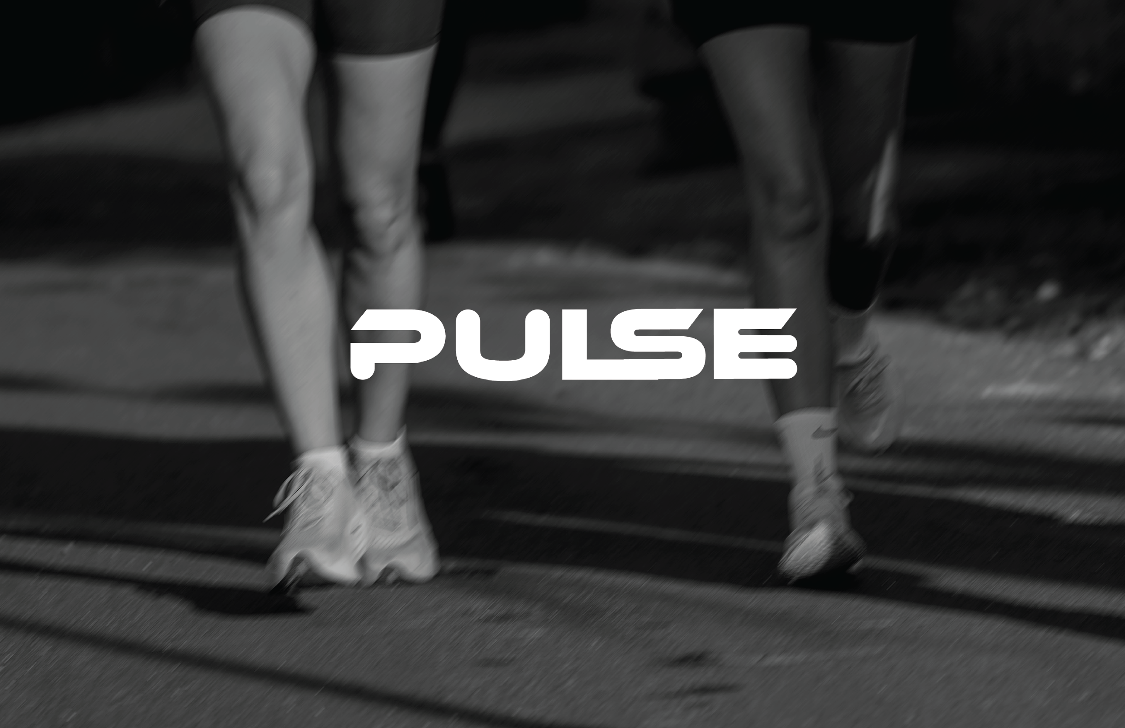
PULSE Campaign featuring brand identity and photography coordination
Final Deliverables
My final deliverables included packaging for both the electrolyte mix and energy bites, along with supporting branded items such as a yoga mat, apparel line, and additional training accessories intended to highlight the role of each product in a runner's training and recovery routine.

Post Run Electrolyte Drink Mix Box
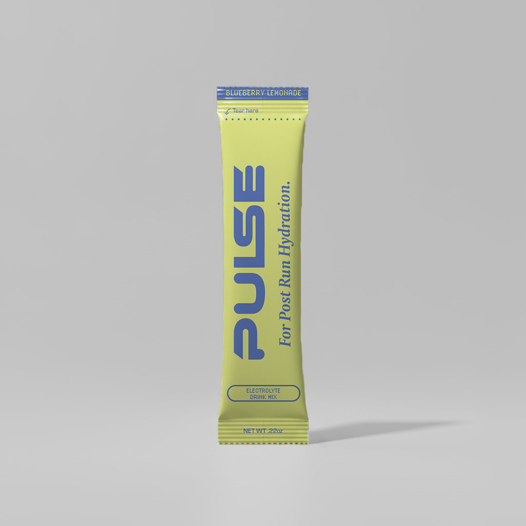
Individual Electrolyte Drink Mix Packet

Individual Mid Run Energy Bites Packet

Individual Mid Run Energy Bites Packet

Individual Mid Run Energy Bites Packet

Individual Mid Run Energy Bites Packet
Final Installation
What began as a thesis paper evolved into a “storefront” installation. This project is an expression of my passions for design and running. The final piece is the result of extensive research and creative exploration. It reflects my knowledge in the importance of nutritional education for healthy performance and how thoughtful design can support intentional fueling for athletes as they train.

Final Installation - Back

Final Installation - Front